Wedding Cake Ideas by Color: How to Style Your Dessert for a Cohesive 2026 Palette

I always tell my couples that your wedding cake is so much more than just the final course of the night. It’s a major piece of your design story. When it’s styled intentionally, the cake becomes this beautiful visual bridge that ties your florals, your linens, and your venue’s atmosphere all together.
But I also know that ‘matching’ your cake to your colors can feel a little tricky. You want it to feel cohesive, but you definitely don’t want it to feel forced or dated. If you’re wondering how to weave your palette into your cake design with a modern, sophisticated touch, here is how we make that happen.
Why the Cake-to-Palette Connection Matters
It’s easy to think of the cake as its own separate ‘thing’—it sits on its own table, often in its own corner. But when the cake truly echoes your color palette, it does something magical for the room. It makes the entire design feel intentional and complete.
Think of it this way:
When your photographer captures a wide shot of your reception, you want the cake to feel like it belongs in that world, not like it was dropped in from a different wedding. But here is the secret—matching doesn’t mean you need to cover the entire thing in bold frosting. In fact, the most elegant cakes I see are the ones that use a light touch. It’s those subtle, thoughtful details that whisper your color palette rather than shouting it, creating a look that feels elevated and, above all, timeless.
How to Weave Your Palette into Your Cake (Without Overdoing It)
Before you dive into Pinterest boards, I always suggest keeping a few ‘Modern Rules’ in mind. The goal isn’t to make the cake the same color as your bridesmaid dresses; it’s to make the cake feel like it belongs in the same family. Here is how I approach it:
Think of Color as the Accent, Not the Canvas
The most sophisticated cakes almost always stay neutral—think soft ivories, warm creams, or even a very pale stone. Instead of a solid-colored cake, let your palette appear through the details. Whether it’s a delicate pressed flower, a thin velvet ribbon, or a subtle wash of color at the base, using color as a highlight makes the design feel curated rather than ‘themed.’
Repeat Your Design Language
Your cake should pull inspiration from the elements your guests have already seen. If you’re using a specific botanical illustration on your stationery, see if your baker can hand-paint a similar detail onto one of the tiers. If your tables are styled with gold flatware, a thin gold rim around the base of the cake can tie the whole reception together beautifully.
Let Texture Tell the Story
Sometimes, you don’t even need color to match a palette. Texture can communicate a ‘vibe’ just as well as a hue can. For a 2026 European-inspired wedding, a ‘plaster’ or ‘stone’ buttercream finish mimics the architecture of a courtyard. For a romantic garden wedding, soft fondant folds can mimic the movement of a silk gown. It’s about matching the energy of your wedding, not just the swatch.
Designing Your Cake by Palette: A Few of My Favorite Directions
I’ve seen every kind of color story, but when it comes to the cake, these are the approaches that always feel the most ‘current’ and high-end. Here is how I would style your cake based on the palette you’ve chosen:
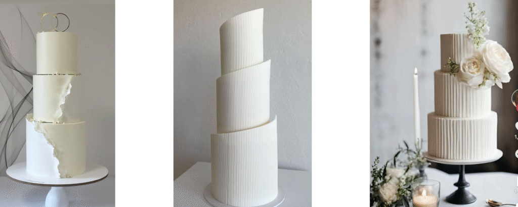
For the Timeless Minimalist (Whites, Ivory, and Stone)
If your wedding is all about clean lines and neutral tones, your cake should feel like a piece of sculpture. Instead of adding color, play with texture. Think of soft buttercream waves, a ‘plaster’ finish, or even just a few minimal, architectural flowers. It’s calm, it’s classic, and it never goes out of style.
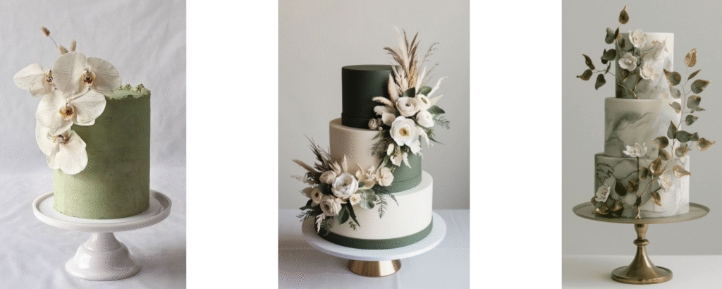
For the Organic & Greenery-Inspired (Sage, Olive, and Smoky Jade)
When it comes to a green palette, many couples are afraid to let the cake itself take on any color. But as you can see, using green as a base can actually be incredibly sophisticated if you do it with intention.
The secret is balance. If you’re opting for a green cake—whether it’s a soft, textured sage or a bold, dramatic forest green—keep your accents light and natural. I love seeing a colored tier paired with a neutral one, or a solid green base adorned with crisp white orchids and wild, dried textures. It creates this beautiful, ‘architectural’ look that feels fresh and organic. Whether you use a wash of watercolor green or a bold, solid tier, let the natural elements like eucalyptus or olive branches tie it back to your venue for a cohesive, 2026-ready design.
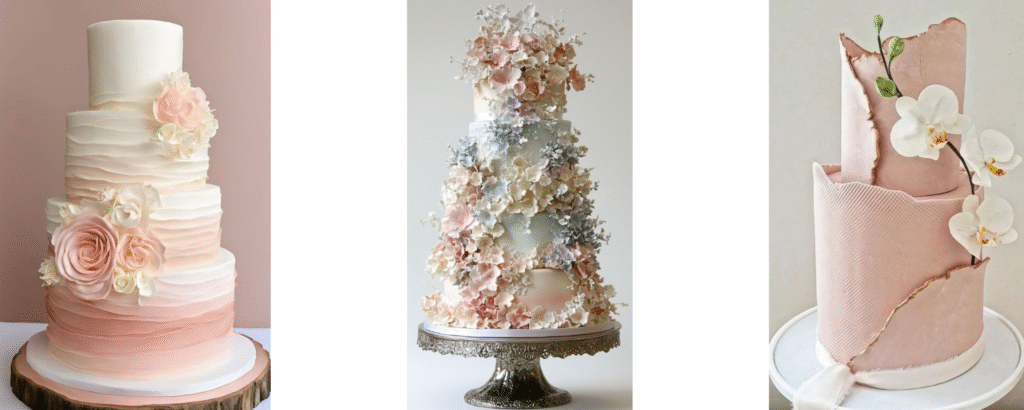
For the Soft Romantic (Blush, Peonies, and Pastels)
When you’re working with pinks, the goal is to keep the look from feeling too ‘sugary.’ As you can see in these designs, the most beautiful romantic cakes use color to highlight texture and movement rather than just sitting flat on the surface.
I love seeing blush tones used in a way that feels intentional and artistic. Think of soft watercolor gradients that mimic the natural ombre of a rose petal, or architectural details like ‘torn’ deckle edges and fabric-effect textures. By pairing these soft hues with delicate sugar flowers or a single crisp orchid, you create a cake that feels incredibly romantic but remains firmly modern. It’s about creating a look that is light, airy, and full of sophisticated movement.
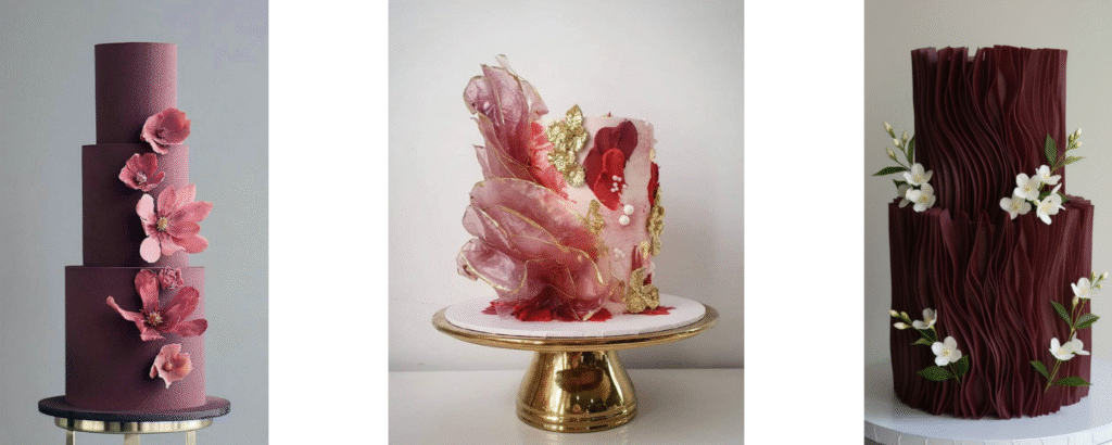
For the Moody & Dramatic (Burgundy, Wine, and Deep Plum)
Moody cakes are all about intentional contrast. While many fear that deep colors will feel ‘heavy’ in a reception room, these designs prove that dark tones can actually feel incredibly sophisticated and modern.
I love seeing deep, wine-toned palettes expressed through high-texture finishes—think of sculptural ruffles that mimic fine silk or matte stone effects that catch the light beautifully. Instead of a flat, dark surface, these textures create a sense of movement and depth. To keep the look balanced, try adorning a rich, moody base with delicate white floral accents or shimmering gold leaf. When styled with warm candlelight, these cakes create a stunning ‘moment’ in the room that feels dramatic, refined, and completely unforgettable.
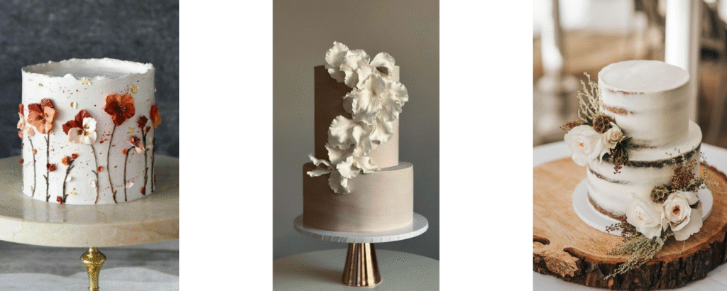
For the Earthy & Sun-Drenched (Terracotta, Sand, and Warm Beige)
This is that 2026 ‘warmth’ we’ve been talking about—a palette that feels less like a choice and more like a sunset. For these weddings, I love moving away from smooth finishes and leaning into tactile, organic textures.
Think of semi-naked cakes that let the golden layers peek through, or ‘sand-textured’ buttercream that feels like it belongs in a desert or a coastal setting. I’m also a huge fan of adding color through botanical artistry—delicate, hand-painted wildflowers in terracotta and ochre tones, or even pressed dried elements. When you pair these earthy bases with sculptural white orchids or dried grasses, the cake feels grounded, relaxed, and perfectly in tune with a natural, sun-drenched venue.
Common Styling Mistakes (And How to Pivot)
Even with the best intentions, it’s easy to fall into a few common styling traps. If you want your cake to feel like a piece of 2026 editorial design, here are the things I always tell my couples to keep in mind:
Matching Your Swatches Too Literally: You don’t need your frosting to be the exact hex code of your bridesmaid dresses. Instead of an all-over color match, look for ways to repeat your palette through tonal accents like ribbons, florals, or delicate hand-painted details.
Forgetting the ‘Glow’ Factor: Be wary of using heavy, bright food coloring—especially for soft palettes like butter yellow or dusty blue. These colors look most sophisticated when they feel like a natural ‘glow’ or a soft watercolor wash, rather than a solid block of saturated pigment.
The ‘More is More’ Trap: It can be tempting to try and fit every single wedding color onto the cake. Restraint is your best friend here. Often, a neutral cake that highlights just one or two of your primary colors through texture or florals creates a much more powerful statement.
Designing in a Vacuum: Your cake doesn’t live in a bubble—it lives in your venue. Always consider the lighting and the backdrop. A dark, moody cake needs candlelight to shine, while an airy, textured white cake finds its rhythm in a sun-drenched garden.
When you’re feeling unsure, remember: neutral is a design choice, not a fallback. If you keep the cake itself timeless and neutral, you allow the styling details—the flowers, the stand, and the textures—to do the work of connecting it to your story.
The 2026 Cake Table Checklist
Before you consider the design “done,” don’t forget these three elements that frame the cake:
The Stand: Move away from standard silver or plastic. For 2026, think of stone plinths, raw wood slices, or vintage gold pedestals that match your venue’s textures.
The Backdrop: Ensure your cake isn’t placed against a distracting fire exit or a cluttered corner. A simple linen drape or a clean stone wall makes the colors pop in photos.
The Lighting: Avoid overhead spotlights. Use warm pin-lights or a cluster of pillar candles at the base to create that “luminous” glow we’ve been aiming for.