Dusty Blue Gold Wedding Styling

Welcome to the Dusty Blue – Gold Wedding Style Studio

There is a reason Dusty Blue and Gold remains a favorite year after year. It is a palette that feels like a quiet conversation, composed, timeless, and effortlessly refined. It blends the cool, calming depth of blue with the glowing warmth of gold to create an atmosphere that feels quietly elevated without ever needing to shout.

I’ve designed this Wedding Style Studio to be more than just a list of items. It’s a roadmap for visual flow. My goal is to help you see how these elements, from the weight of your stationery to the flicker of a candle—work together to tell a single, intentional story. When done right, this palette feels like a soft romantic reset, where the blue leads the way and the gold acts as the light that pulls the room together.

The Art of Balance: Key Styling Notes

To keep this look feeling modern and editorial rather than “staged,” I always recommend a few core principles of restraint:

  • Defining the Lead & the Highlight: Allow dusty blue to lead in larger visual areas—think flowing velvet or chiffon linens, bridesmaid attire, and ceremony aisle runners. Gold should be used as a strategic highlight—a “flicker” on the table via flatware or a delicate candle holder—rather than a dominant force.

  • A Study in Texture: Depth comes from materials, not just color. Balance matte textures, like woven placemats or soft fabric napkins, with polished metallic finishes to add luxury without visual clutter.

  • The “Luminous” Neutral: Dusty blue pairs beautifully with warm whites and ivory, creating a soft, painterly transition rather than sharp definition. This is especially suited for grand indoor venues where high ceilings and natural light can enhance the palette’s softness.

  • Florals & Atmosphere: Your florals should feel light and structured, featuring white blooms and lush greenery punctuated by muted blue accents. To finish the look, never underestimate candlelight. Soft lighting warms the cool blue tones, ensuring the atmosphere feels inviting and soulful as the sun goes down.

Table Styling Picks

Core elements that define the overall tone of the reception

The table setting is where this palette truly comes to life. It’s a study in balance: the cool expanse of the blue meets the flickering warmth of the gold. In these inspiration picks, you can see how scale and texture interact to create a look that feels intentionally composed for an elegant evening.

Table Linens
Dusty Blue - Gold Wedding Styling
Inspiration

Your linens are the visual foundation. Dusty blue thrives in soft, muted tones rather than saturated hues, which allows your gold accents and candlelight to pop naturally. Look for fabrics with a beautiful drape, like the flowing blue cloths seen in the ballroom settings, prioritizing texture over heavy embellishment.

Tablecloths
Runners
Napkins
Gold Napkin Ring
Chair sashes
Dinnerware & Accessories

Use neutral dinnerware to provide structure, then introduce gold as the “jewelry” of the table. Gold-rimmed chargers, polished flatware, and subtle metallic accents on glassware elevate the setting without overwhelming the blue base.

Gold cutlery
Gold plate charger
White Plate
Candles & Holders

Candlelight is the secret ingredient that keeps dusty blue from feeling “cold”. A mix of heights—using tall, slender tapers in gold holders, creates a visual rhythm across the table, adding depth and a welcoming soul to the room.

Candle Holder
Tealight Candle

Florals & Decor

Supporting elements that add softness and dimension

For 2026, we are moving toward florals that feel structured and intentional. In a Dusty Blue & Gold palette, “less is more” leads to a much more polished effect.

Bouquets & Florals

Keep your arrangements timeless by centering them around white and ivory blooms. Dusty blue should be a whisper, not a shout, introduced through delicate accent flowers or a long, silk ribbon trailing from the bouquet. This keeps the look light and prevents the blues from feeling too heavy in photos.

Bridesmaid bouquets
Corsage
Boutonniere
Centerpiece Decor

Your centerpieces should work in harmony with your table styling, not compete with it. Low, lush arrangements paired with those tall gold tapers create a beautiful contrast in height while maintaining a clear “line of sight” for your guests to converse.

Gold vases
Centerpiece Flower

The Budget Perspective: Styling with Confidence

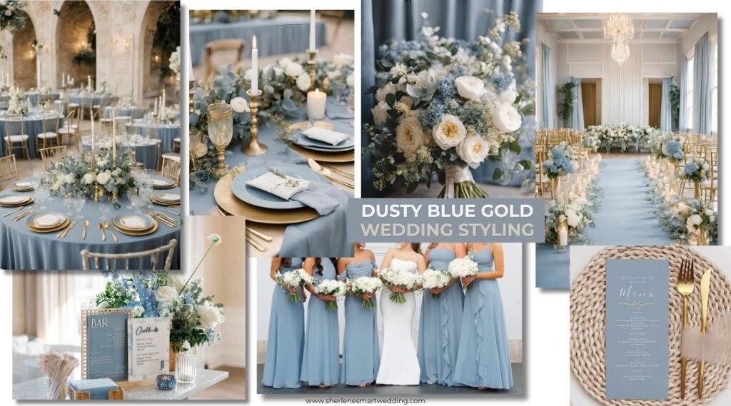
How to approach Dusty Blue & Gold at every investment level

Dusty Blue and Gold is often perceived as a “formal” or “luxury” palette, but in reality, it is highly adaptable when styling priorities are clear. The secret isn’t in how much you spend, but in where you choose to create impact. This palette rewards thoughtful, consistent choices over sheer quantity; it is about visual balance rather than aiming for perfection.

Defining Your Investment

While exact costs vary by location and vendor, the visual hierarchy of this palette stays the same across all levels. The below is how to envision your styling spend for decor and atmosphere.

The Refined DIY (Lower Investment): A focused approach that prioritizes high-impact linens, intentional candlelight, and restrained floral use.

The Balanced Edit (Moderate Investment): A curated mix of rented elements, select floral focal points, and layered table details.

The Fully Styled Vision (Higher Investment): This level allows for fuller, more complex floral installations, upgraded specialty tableware, and multiple layers of atmospheric lighting.

Where to Prioritize (The “Visual Anchors”)

To get the greatest return on your design investment, put your budget into these three areas.

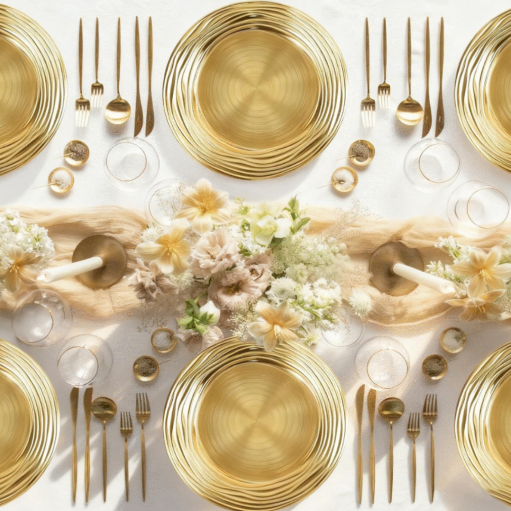
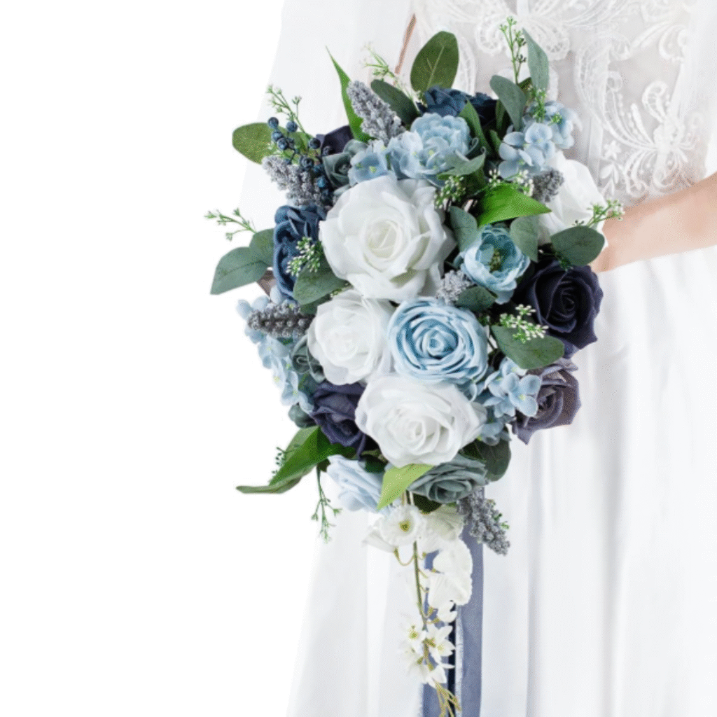
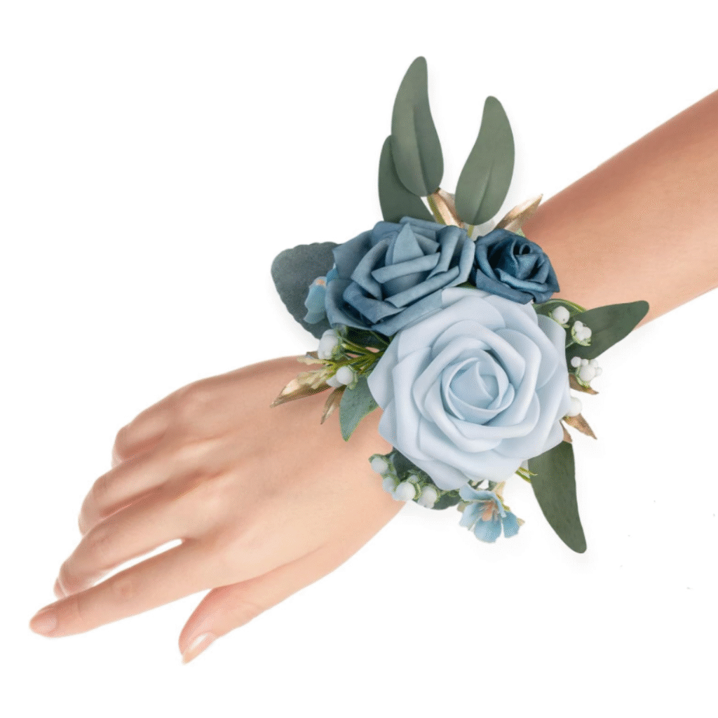
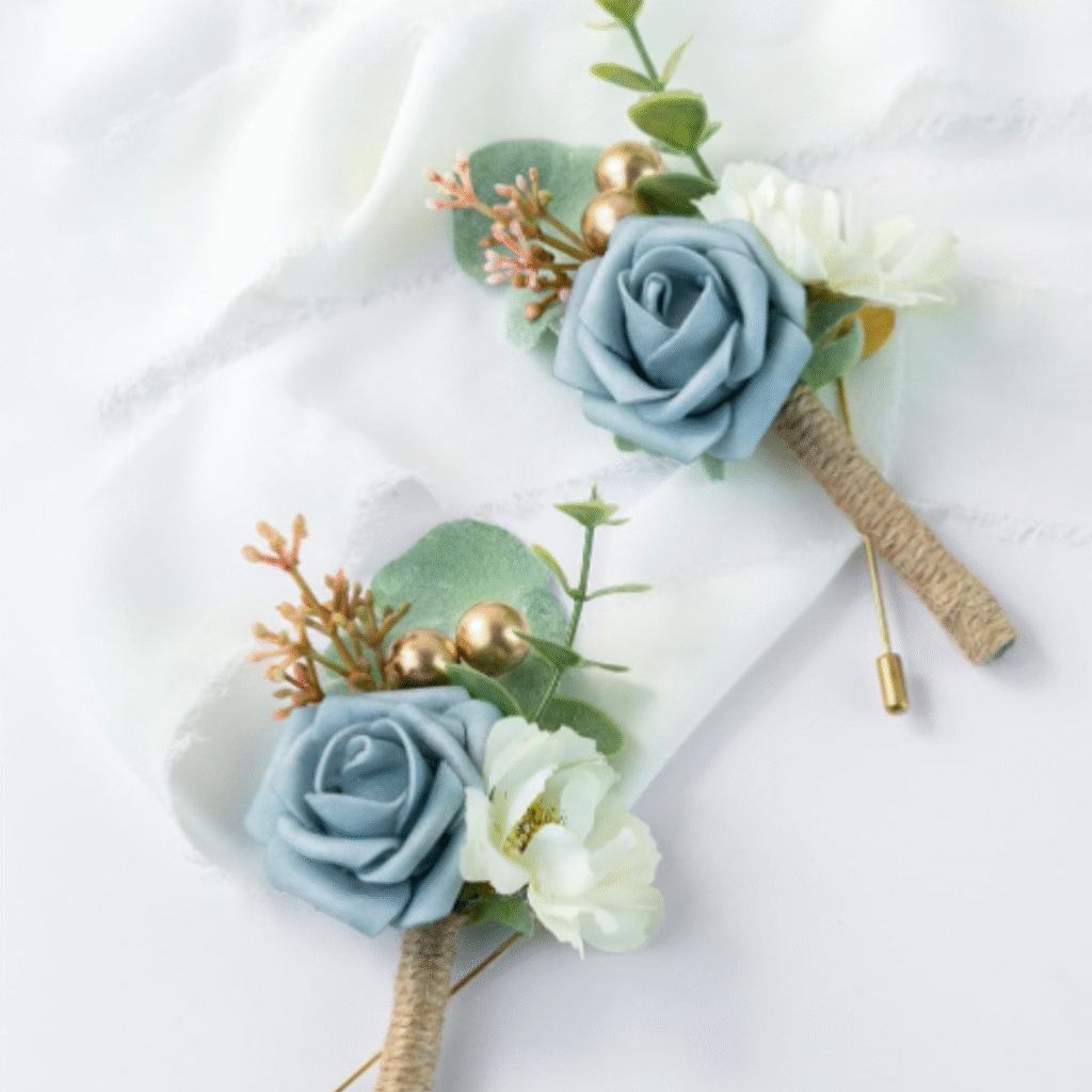
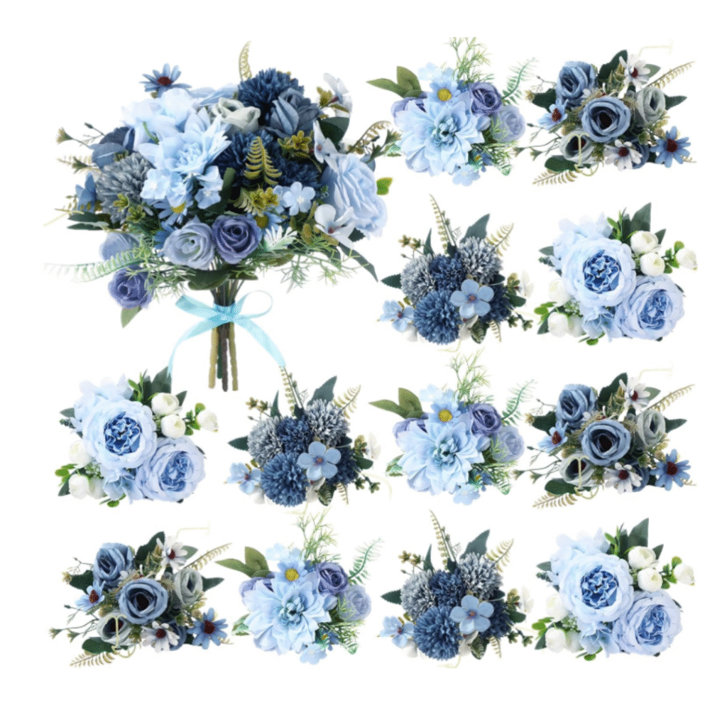
Florals: Even in smaller quantities, well-placed, light-toned arrangements elevate the entire setting.

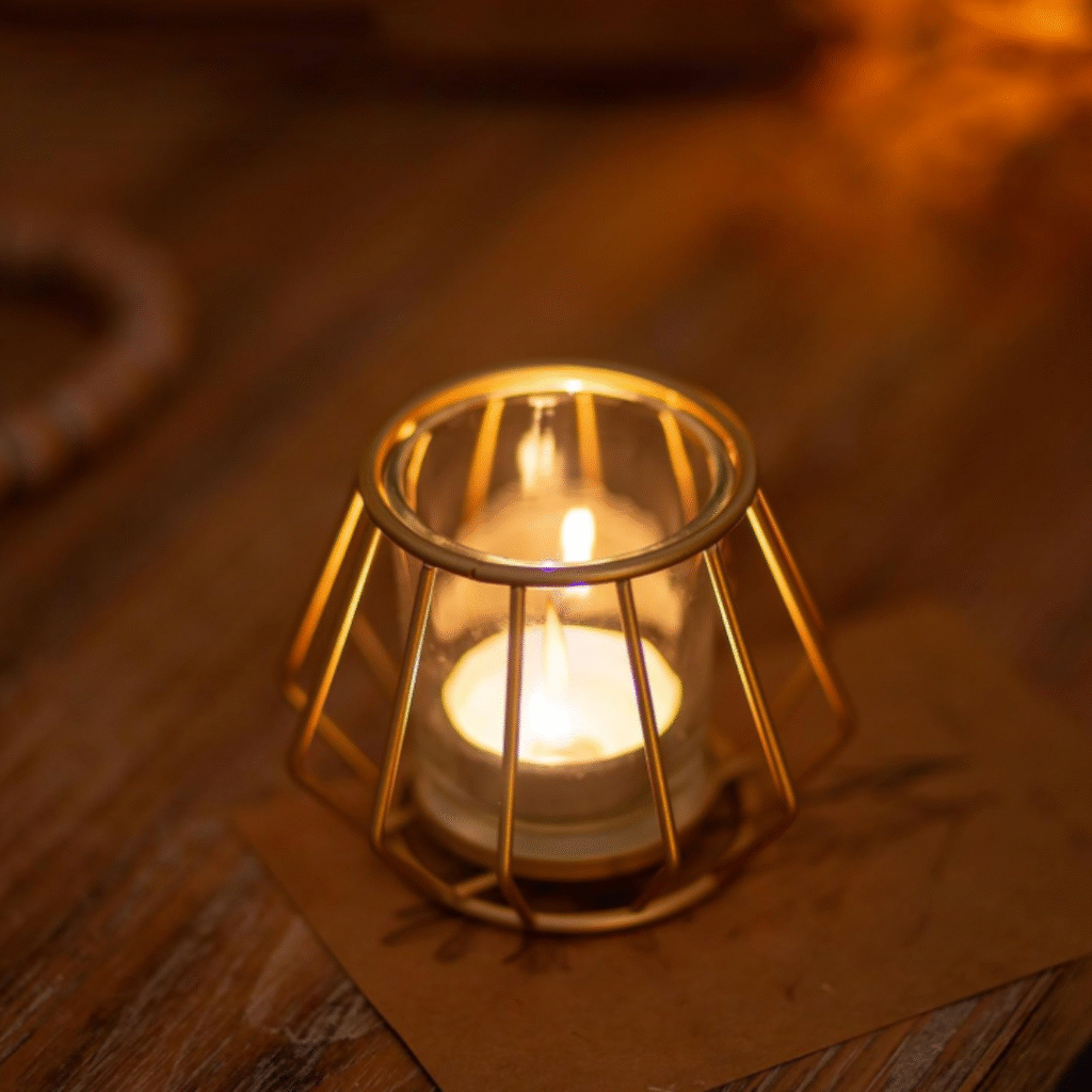
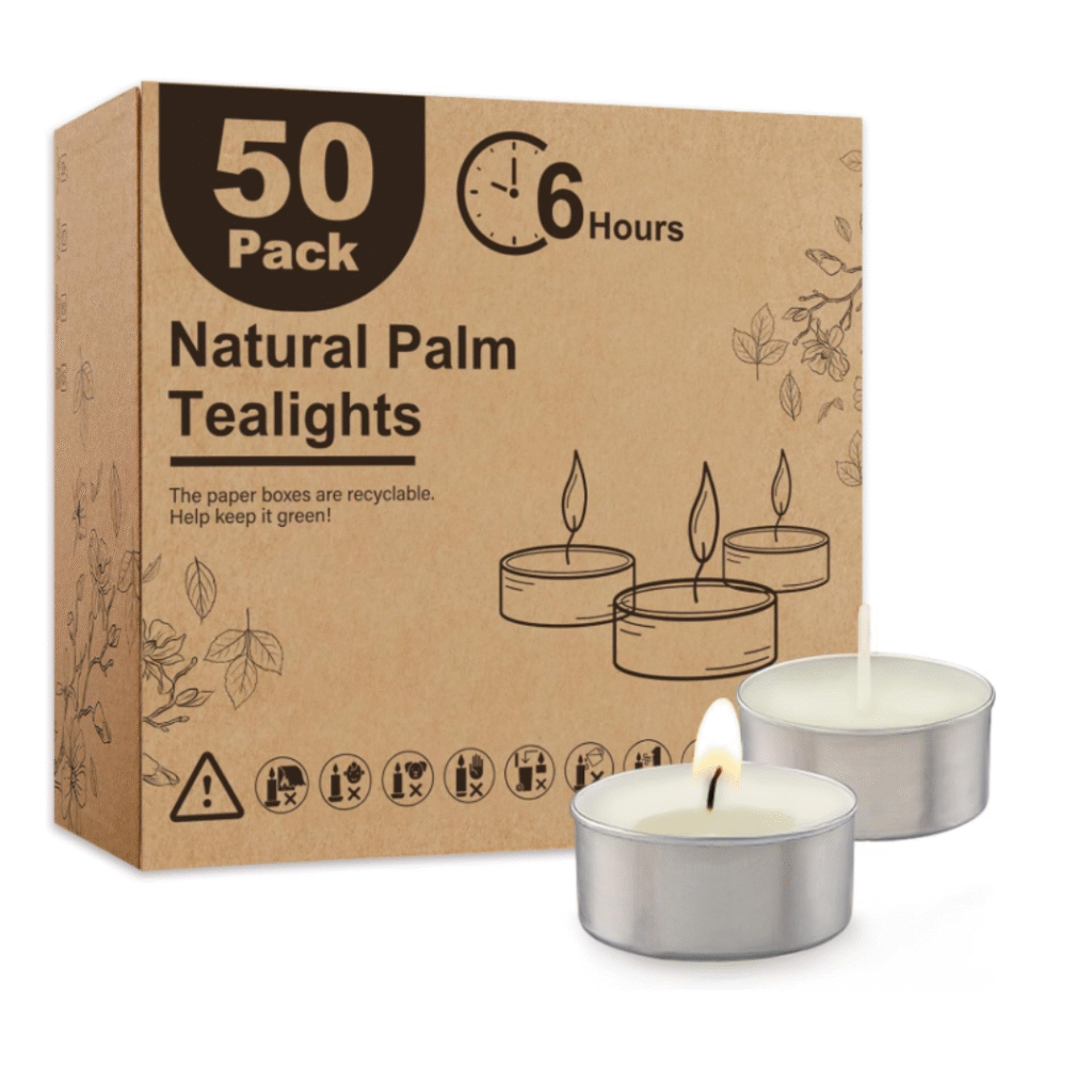
The Glow: Warm candlelight and strategic lighting soften the cool dusty blue tones and make the gold accents truly sing.

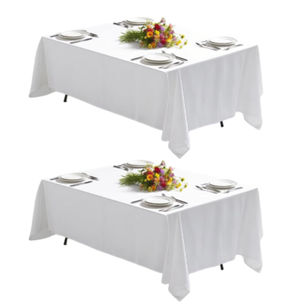
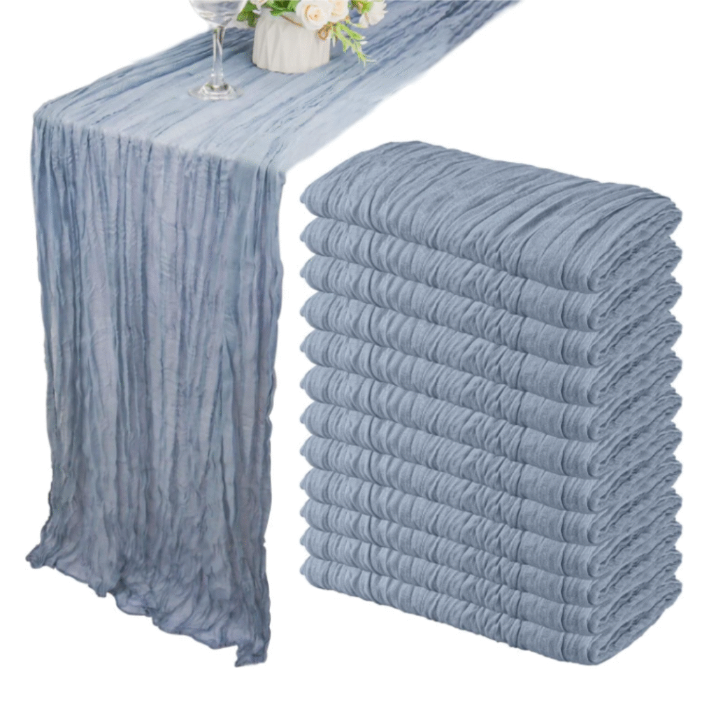
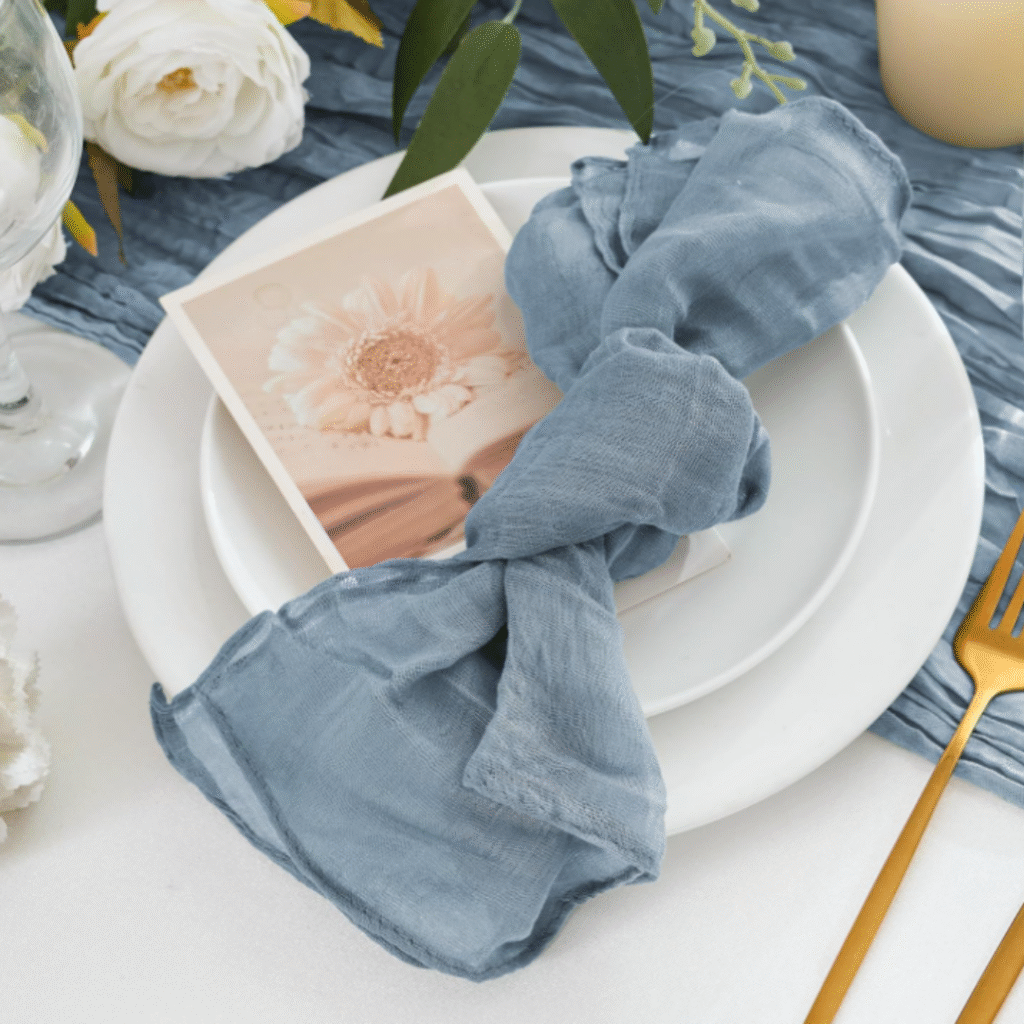
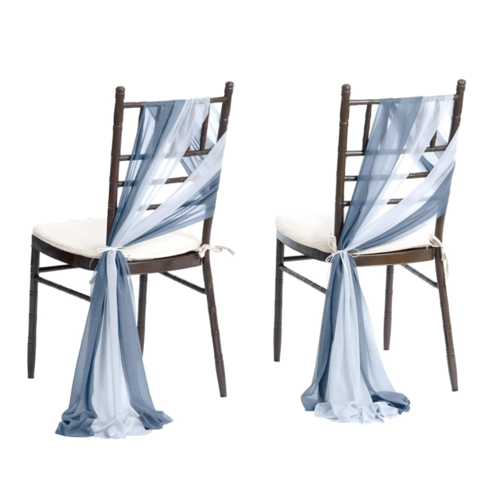
Consistent Linens: A unified table base creates instant cohesion and a high-end feel, even with minimal decor.

Where to Simplify

You can reduce costs without losing the “soul” of the design by making these intentional pivots:

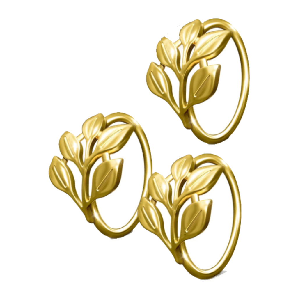
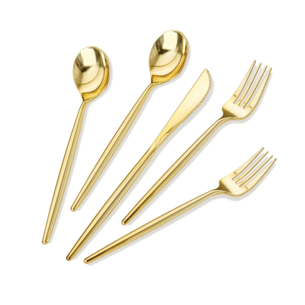
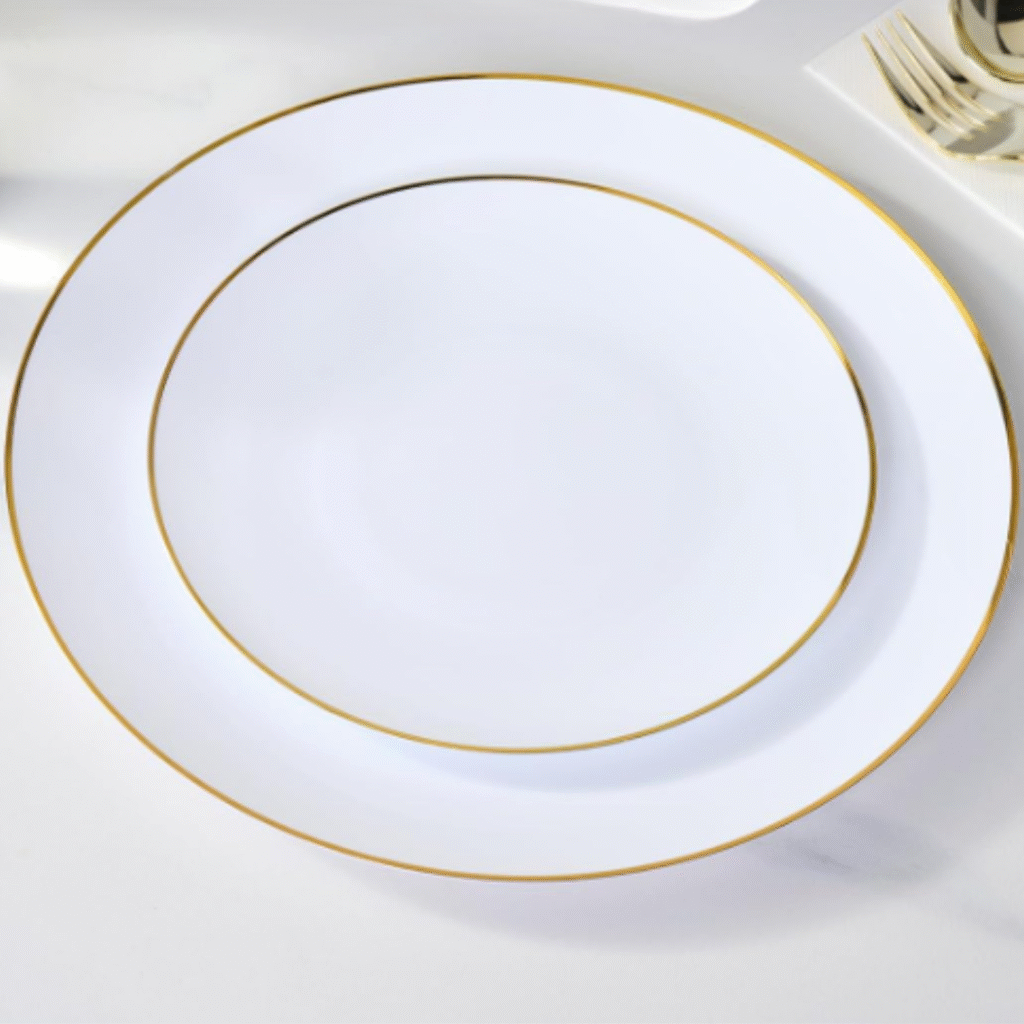
Dinnerware: Simple, neutral plates without metallic rims still photograph beautifully and provide structure.Table Accessories: Fewer, intentional pieces are always more effective than mixing too many elements.

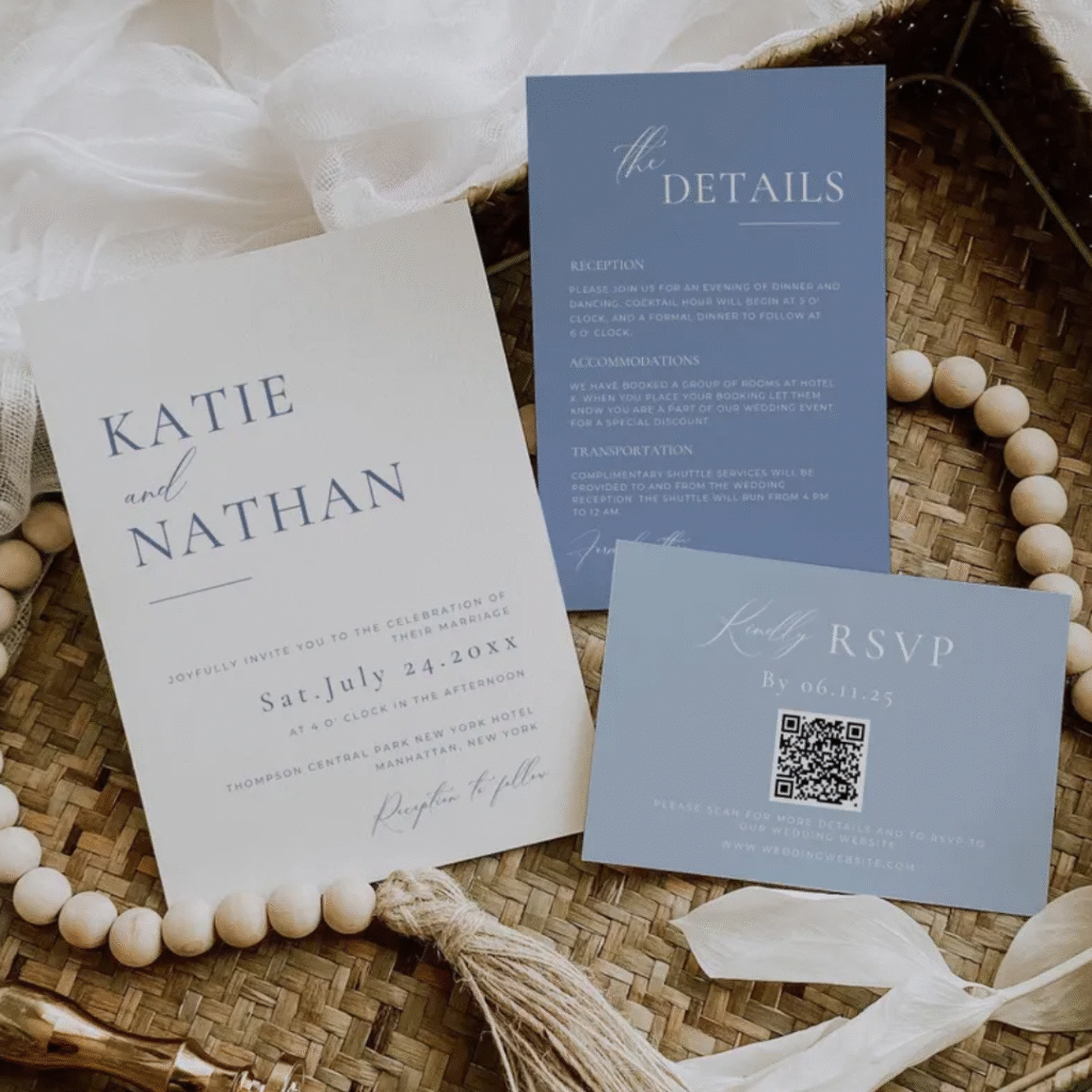
Stationery: Minimalist place cards or clean menus maintain elegance when designed with a focus on typography.

The Stylist’s Take on DIY

Understanding what you can realistically handle will save both your budget and your sanity.

DIY-Friendly: Table linens, candles, holders, and paper details are wonderful projects to manage yourself.

Vendor Recommended: I suggest professional support for large-scale floral installations or ceremony backdrops to ensure that “fine-art” finish.

A Final Thought on Styling

 A Dusty Blue and Gold wedding looks its most refined when gold is treated as an accent, not a feature. Scaling back on the metallic elements doesn’t make the wedding less elegant—often, it makes the design feel more intentional and considered.

Bridal & Bridesmaid Picks (Upcoming)

How attire complements the overall palette

Attire is the largest “moving” element of your wedding design. When working with Dusty Blue and Gold, the goal is to choose fabrics that capture the light and movement shown in our inspiration gallery.

Bridesmaid Dresses

To achieve a high-end look, prioritize fabric flow and tone variation. Chiffon or soft tulle in a muted dusty blue creates a romantic, “watercolor” effect when the group stands together. Rather than perfectly matching every gown, consider slight variations in necklines to add a modern, editorial edge while staying within the same color family.

Dusty Blue chiffon
Satin dresses
Mix & match styles
The Bridal Look

While the bride typically remains in white or ivory, you can pull the palette in through subtle gold jewelry or a champagne-toned shoe. This adds the necessary “warmth” we’ve discussed, ensuring the bride feels connected to the overall design without losing her spotlight.

Accessories

Accessories should act as a refined highlight. Think of delicate gold-threaded veils or hairpieces that catch the candlelight during the reception, echoing the metallic accents on your tablescapes.

Earrings
Hair combs
Shoes

Favors & Details

Small elements that complete the guest experience

The final layer of design is where you can truly show your guests how intentional every choice has been. These details ensure the wedding feels integrated rather than a collection of separate items.

  • Stationery & Signage: Your menus and place cards are the perfect place to let the “Blue lead and Gold accent”. A dusty blue cardstock with gold-foiled calligraphy or a simple gold frame for table numbers (as seen in our gallery) creates a polished, cohesive touch.

  • Wedding Favors: Choose practical, understated favors that align with the palette. Small boxes in dusty blue tied with a gold silk ribbon, or perhaps custom-labeled treats that feature your palette’s signature tones, serve as a thoughtful final “thank you”.

  • The Guest Experience: Every finishing touch—from the way a napkin is folded to the choice of a favor—should feel like it was curated specifically for this atmosphere. By keeping these details functional yet beautiful, you ensure the design is memorable even after the last candle is blown out.

Small candle favors
Wedding Chocolate Favor
Wedding Stationery

Similar Palettes You May Love

Dusty Pink - Green Sage Wedding Styling
Smoky Jade Wedding Styling (upcoming)

Help Me Choose Next Month’s Palette!

Screenshot 2025-12-02 130624

Not sure what palette to create next? I’d love your input!

💬 Tell me which wedding color you want to see next
and I’ll design the most-requested palette every month.

Planning a 2026–2027 wedding?

Get weekly color palettes, styling ideas, and decor tips.

Or explore Free Resources for checklists, venue guides, and planning tools.

Let’s Stay Inspired Together

Have questions or need help?
We’d love to hear from you.